The pandemic has affected virtually every single industry. Industries that rely on mass attendance, like events and education, in particular, were shown the importance of having a solid website. The show(s) had to go on and learning couldn’t come to a grinding halt just because in-person classes got canceled.
Function is critical when you’re designing websites for educational institutions. From application criteria to course options to application deadlines, it should find a way to display a wealth of information logically.
Visually it should also pack a punch. You’re mainly targeting younger audiences and to them looks matter.
To help you strike the right balance between function and form, here are essential features that every educational website should try to incorporate. You’ll see that many of these best practices apply to website design in general, but the trick is to apply it to your specific context.
The School of Educational Website Design: Essential Features and Tips:
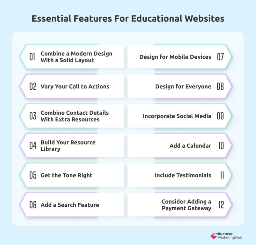
- 1. Combine a Modern Design With a Solid Layout
- 2. Vary Your Call to Actions
- 3. Combine Contact Details With Extra Resources
- 4. Build Your Resource Library
- 5. Get the Tone Right
- 6. Add a Search Feature
- 7. Design for Mobile Devices
- 8. Design for Everyone
- 9. Incorporate Social Media
- 10. Add a Calendar
- 11. Include Testimonials
- 12. Consider Adding a Payment Gateway
- Frequently Asked Questions
1. Combine a Modern Design With a Solid Layout
Your target audience will mostly be younger, making the visual aspect of your website even more important. You can’t afford to include outdated web design trends.
Aside from it being in line with current times, it should also align with your branding. This means that it will need to incorporate your color palette, among other things.
Whichever style you decide to go for, stay clear of clutter. Clean design is good design.
This means that you should embrace white space, which will help website elements, stressed students, and overbearing parents alike to breathe. Not only will it prevent overwhelming visitors, but it will also help you to maintain the professional image associated with educational institutions.
Keeping your design clean and clutter-free will also aid with navigation. One way that you can improve the navigation of an educational website is to create a click-activated journey, for example. Tools like these that help prospective students to build their course can streamline the navigation as well as help undecided students. Plus, it’s also more engaging than simply presenting them with conventional, drop-down menus.
That said, it’s no replacement for an intuitive navigation bar. There should be a strong layout that promotes readability. To do this, you’ll need to put in place a hierarchy by using headings and thinking carefully about which element and piece of text must go where.
Basically, it should be easy for everyone, whether that’s a tech-savvy student or a parent suffering from technophobia, to find what they’re searching for without infinite scrolling. Rather keep your home page straightforward and use quick links to guide them to relevant pages. You can, for example, offer visitors a list of descriptions that best describe them, like “I’m a parent/student/donor. Then, by clicking on the most suitable description, they’ll be redirected to a custom page with tailored information.
2. Vary Your Call to Actions
Any experienced marketer will be able to tell you that you need to adapt your messaging so that it speaks to consumers across various stages of the buyer’s journey. While the ultimate goal is to clinch a sale, there are many other secondary goals that you can set for yourself before they’re ready to buy. Examples include signing up for a newsletter, creating an account, sharing a blog post on social media, downloading a lead magnet, etc.
In the educational sector, it works similarly. Prospective students visit your website with various needs. Some are ready to enroll immediately; others just want to find out about requirements.
These are just two obvious needs. From finding out about financial support to exploring campus life to researching available accommodation, there’s much more to studying that students need to explore.
It presents a challenge to your website designers, but one that can be solved by incorporating a range of different call-to-action buttons. To help visitors easily find more information for the stage of the learning journey they’re at, ensure that these buttons are clear. Both in wording and in visual appearance.
To do this, use a verb followed by one or or two words and use contrasting colors. Then, to ensure that you have a winning formula, use A/B testing to see which combination of wording and coloring is most effective.
3. Combine Contact Details With Extra Resources
To encourage engagement, ensure that you offer multiple ways that they can reach you. Asking them to complete an online form is a popular approach. To make this step appear as less of a schlep, you can also share a downloadable resource that offers valuable content like college comparison charts or college readiness checklists.
Not only will this act as a lead magnet, but it can also help students in their preparation and to set your institution apart from other places. There’s a good chance that they already have a list of preferred places and if you’re the backup choice, a school brochure can change that. On the other hand, if you're currently their top choice, sharing a type of prospectus can help cement you as their favorite and serve as a type of affirmation about their choice.
In addition to your standard online contact form, it’s also common practice among educational institutions to include a contact directory. You can, for example, include a page with the details of your staff like name, surname, position, and email address. Depending on the size of your staff, you might also want to include a contact directory that they can search by typing in a surname or position.
4. Build Your Resource Library
Aside from creating downloadable resources that can double up as lead magnets, you should also make a conscious effort of sharing content continuously. After all, you’re an educational institution and to show you’re the real deal you’ll need to establish yourself as a thought leader.
Your website design should be student-centered, but content-driven. A good idea is to include a dedicated blog section where you visitors can find all your pieces. Not only will this help to establish yourself as a credible source of knowledge, but it will also help with your search engine optimization (SEO) strategy.
Growing a blog doesn’t happen overnight. That said, it’s a good idea to have a couple of content pieces ready before publishing your website.
Aside from blog posts, also make space for more interactive content like videos and visuals. As you’ll mainly be designing for a younger target audience, video will work especially well.
Generation Z is much more visually inclined. From informal campus tours to highlights of live events to formal interviews with staff or alumni, there are various video ideas that you can explore and capture in video format. Educational institutions are also realizing the key role that they play in promoting mental well-being and videos can also be used effectively to help curb the pandemic of loneliness reported among students.
You’ll also need to include more “boring” docs like your prospectus. Thanks to advances in technology, educational institutions can now easily share hard copy documents online, eliminating the need for prospective students to visit campus in person.
5. Get the Tone Right
Choosing a tone of voice to use presents a unique set of challenges when writing for college and school websites. You want to connect with your youthful target audience, yet you still need to come across as a voice of authority.
The tone that you use might vary in levels of professionalism and sophistication, depending on whether the content is aimed at donors or future students. However, there should still be an element of consistency that’s easily identifiable with your brand.
When creating this consistent brand tone, consider that there’s a shift from formal to more casual. Educational institutions are realizing the importance of coming across as approachable. For example, first and second-person pronouns are more commonly used nowadays.
Considering the mental health challenges that students face, it’s key that you get the tone right. Words matter and how you say it even more. For students to prosper, there needs to be a relaxing atmosphere and your website copy can help to set that tone already.
6. Add a Search Feature
To make all your content that you’ve spent hours creating easily accessible, include an easy-to-use search functionality. Just like online shoppers have a specific product in mind, prospective students have also probably already narrowed their choice down to a field.
While intuitive navigation will make your content more searchable, also offer a search feature so that they can quickly find a campus, faculty, or course. If possible, allow predictive search to speed up the process even further.
7. Design for Mobile Devices
Nowadays, all websites should be designed with responsiveness front and center. Since 2013, internet usage via mobile devices has increased to a point where internet users across the globe spend nearly 60% of their time browsing the web via their mobile phones.

Source: statista.com
Aside from the sheer volume of traffic that mobile devices generate, non-responsive websites are actually a big annoyance to users. After pages that are slow to load, a website being non-responsive is the second top reason why visitors leave a website, with bad navigation highlighted as the third biggest reason.
It will also win you favor among Google and other search engines.
Basically, you’ll need to ensure that all your web pages display correctly without loading slower. This means that all the elements like CTA buttons should automatically adjust to fit the screen. Opting for central navigation or including an extra menu at the bottom so that all the key pages can be conveniently accessed without straining your thumb is another example of how you can design your website with mobile devices in mind.
That said, it by no means gives you permission to neglect desktop computers. It’s just that the chances are higher that websites that play well with mobile devices will also play well with desktop devices.
8. Design for Everyone
The education industry specifically is at the front of breaking down barriers. However, you can’t promote inclusive education if some will find your website inaccessible.
Here are a couple of the key best practices to follow to make your website accessible:
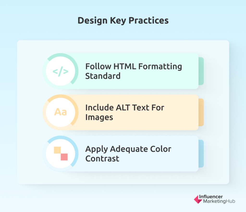
- Follow HTML formatting standard and use a single H1 for the header, followed by H2, H3, H4, etc. for any extra headers
- Include a descriptive ALT text for all images
- Apply adequate color contrast
In addition to these types of technical adjustments that will help visitors with disabilities navigate your website, also think about how you can promote diversity, equity, and inclusion via your website. One way is to double-check that your resources include and cater to underrepresented members of society.
You’ll also need to pay specific attention to the visuals that you include. Photos should be inclusive so that everyone can envision themselves enjoying the college experience.
9. Incorporate Social Media
In addition to your website, you’ll also need to grow your presence on social media actively. Just over 40% of the total time that women between the age of 16 and 24 spend on the internet are spent on social media. While the percentage is lower for men, it’s only slightly with 38.7% of their internet time going to social media. If you’re targeting older adults for postgraduate studies, the picture looks basically the same for those in their late 20s and early 30s.
So, what does this have to do with your website design?
For starters, make it easy for website visitors to follow you on social media. You can also encourage prospective students to share links to your website on social media. Here, your blog design can once again play a key role. Make it easy for readers to share blog posts by adding a share button at the end.
Gone are the days that your website and social media accounts have to be thought of as two distinct owned channels. You can also embed select social media posts and videos on your website. In addition to embedding videos, you can also integrate your social feed. This way, information can be shared in real time, making the overall experience more interactive and engaging.
10. Add a Calendar
Remember that you’re also designing a website for current students and parents. They’ll want a place where they can quickly access all the important dates.
Not only can it help your community to stay up to speed and plan ahead, but it can also serve as a tool to advertise events to prospective students. By adding all your headline events to your calendar, prospective students can get a glimpse of what they can expect.
It doesn’t take rocket science. The biggest challenge will probably be to ensure that all the dates are accurate and up to date. The last thing you want is for aspiring students to rock up to an open day only to find out on arrival that it’s canceled.
11. Include Testimonials
eCommerce brands aren’t the only ones that need to rely on social proof. Unless you’re the likes of Harvard University, you’ll need to include success stories of past students. In fact, even Harvard lists their Nobel Laureates.
That said, you don’t need to have delivered Nobel Prize winners in order to boast with your students’ accomplishments. Potential students want to know the real-life value that your courses can offer. That’s enough.
Instead of merely listing a couple of testimonials, try to incorporate an element of storytelling. It can help you to connect with future students on a much deeper level and help to create a sense of community before they’ve even set foot in a classroom. You can, for example, ask a former student to write a blog post about a typical day in their life or interview a student about a recent success story in a podcast episode.
12. Consider Adding a Payment Gateway
Most of these tips are aimed at schools, colleges, and universities with physical locations. That said, learning is by no means restricted to face-to-face encounters. Online learning is becoming more mainstream.
If you’re thinking about creating an educational website to share content in exchange for a monthly subscription fee, you can also consider adding a payment gateway. Aside from using the subscription model, you can also consider exploring the idea of collecting one-time fees and selling paid online courses or extra services.
Whichever approach you opt for, ensure that you offer a wide range of payment options and prioritize security.
Wrapping Things Up
Design matters a lot when you’re trying to get into the good books of younger audiences. So too does user experience.
Whether you’re trying to sell high-quality, relevant gated content or you’re designing the official website of a successful university, most of the website design best practices will apply. Incorporate responsive design, apply a clear button design, share search-optimized content relevant to their needs, etc.
As your product isn’t tangible, it makes it harder to use popular marketing strategies based on scarcity. In fact, you want to avoid coming across as exclusive.
This makes your website design even more important. It will be one of the few ways that your target audience can reach you and find out more about how your offering will enrich their lives. Just like you expect your students to think long-term, so too should your web design team work with a long-term vision in mind.
Frequently Asked Questions
What is education marketing?
Basically, education marketing includes strategies and campaigns that are designed to help schools, colleges, universities, and even online tutors, to increase student enrollment. Strategies that are typically used include website design and development, lead generation, branding, search engine optimization, social media marketing, and paid media.
Which reliable website design agencies work with the educational industry?
There are several great website design agencies that have a proven track record of designing websites for educational institutions. You can, for example, check out:
- PBJ Marketing
- Straight North
- OHO Interactive
- HEM
- Up&Up
- Carnegie
- WebFX
How can educational institutions market their courses?
Here are some popular marketing strategies that educational establishments can try out:
- Design a responsive website that embraces clean design
- Create dedicated landing pages for different courses
- Include testimonials of previous students on your website
- Encourage past students to leave feedback on online reviews sites and take the time to respond to all online reviews
- Invest in a customer relationship management (CRM) and an email automation tool to streamline your communication with prospective students